ЗМИЙ
A Moscow bar identity built around the image of Zmiy from Slavic mythology and visual references to the Moscow Kremlin walls.
Oksana Antipova
Graphic Designer
ЗМИЙ
A Moscow bar identity built around the image of Zmiy from Slavic mythology and visual references to the Moscow Kremlin walls.
PARANOIA
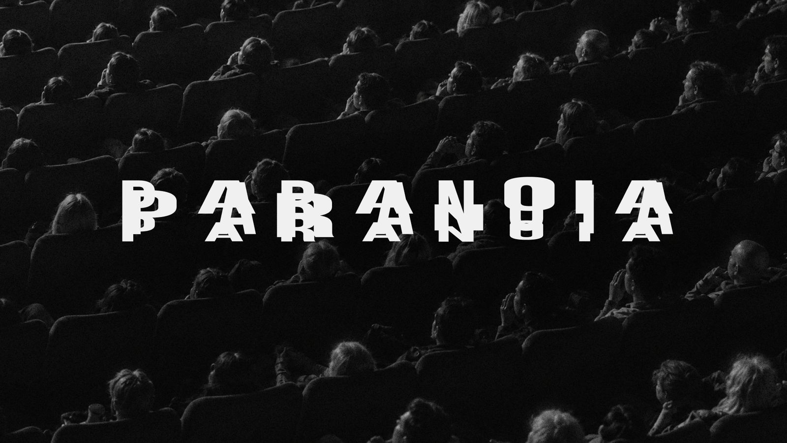
A visual identity built around the repetition and fragmentation of the wordmark. The typographic system shifts in scale, spacing, and density, creating a flexible graphic language that can be adapted across posters, apparel, digital formats, and other brand applications.
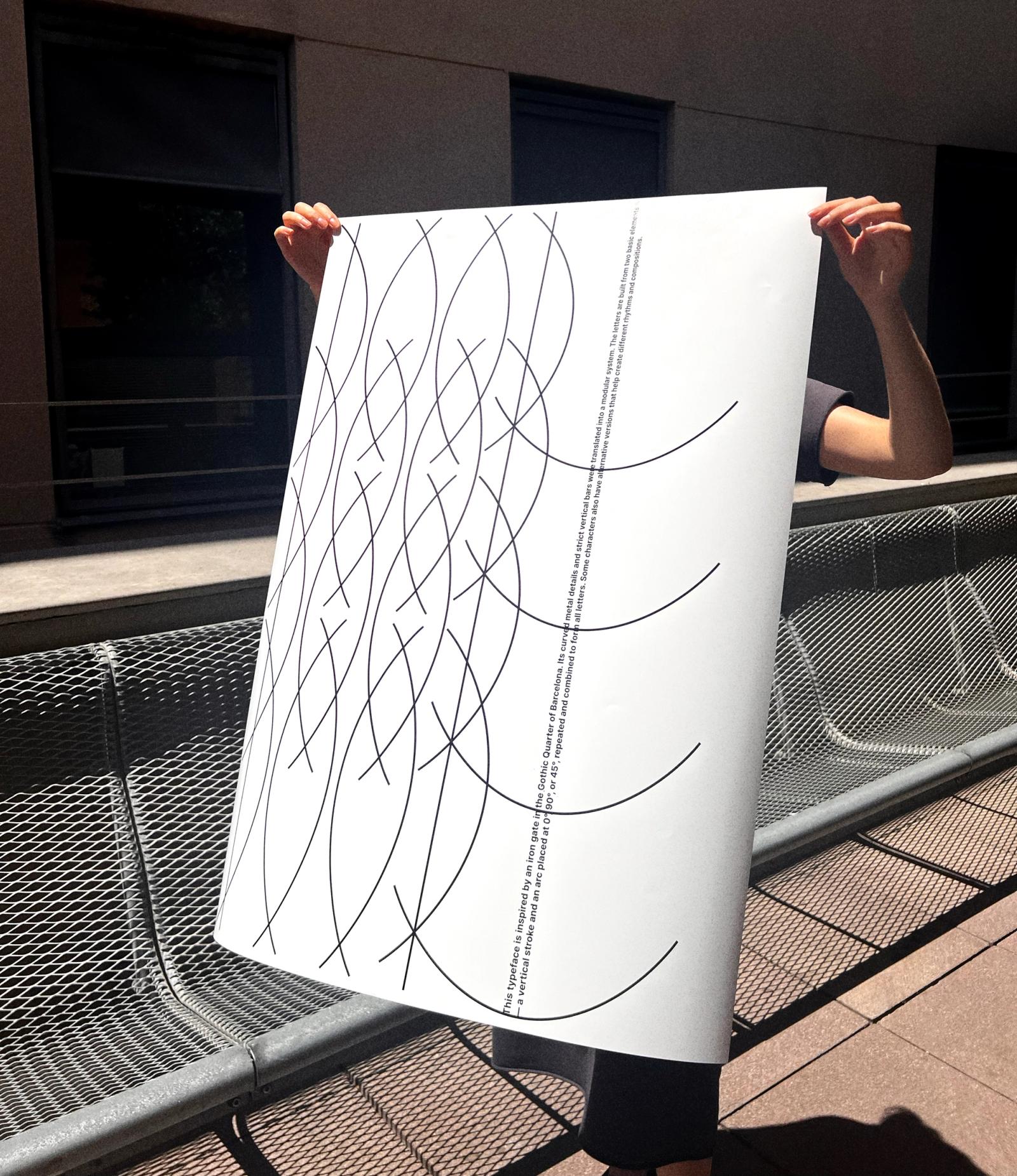
IRON GATE TYPEFACE
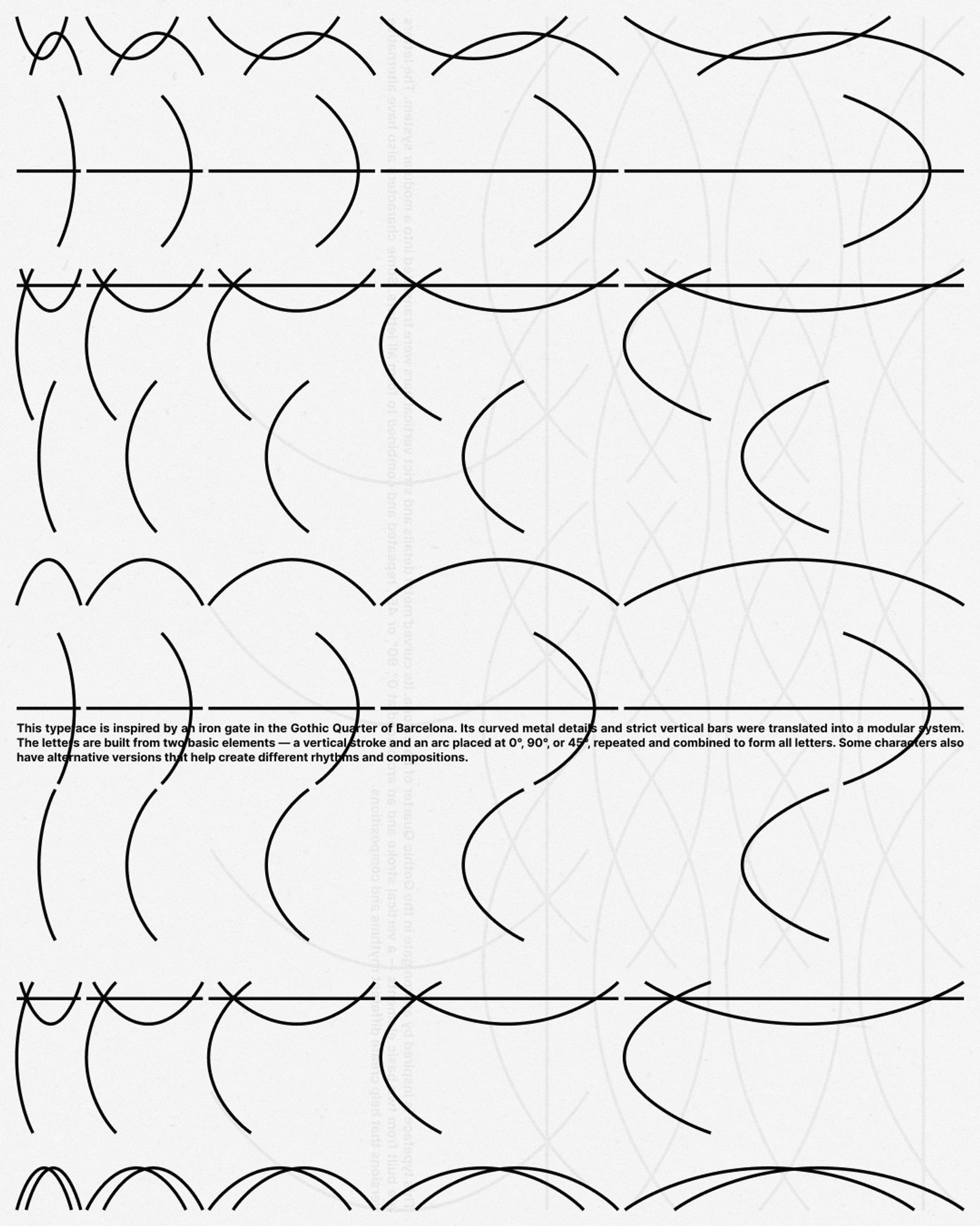
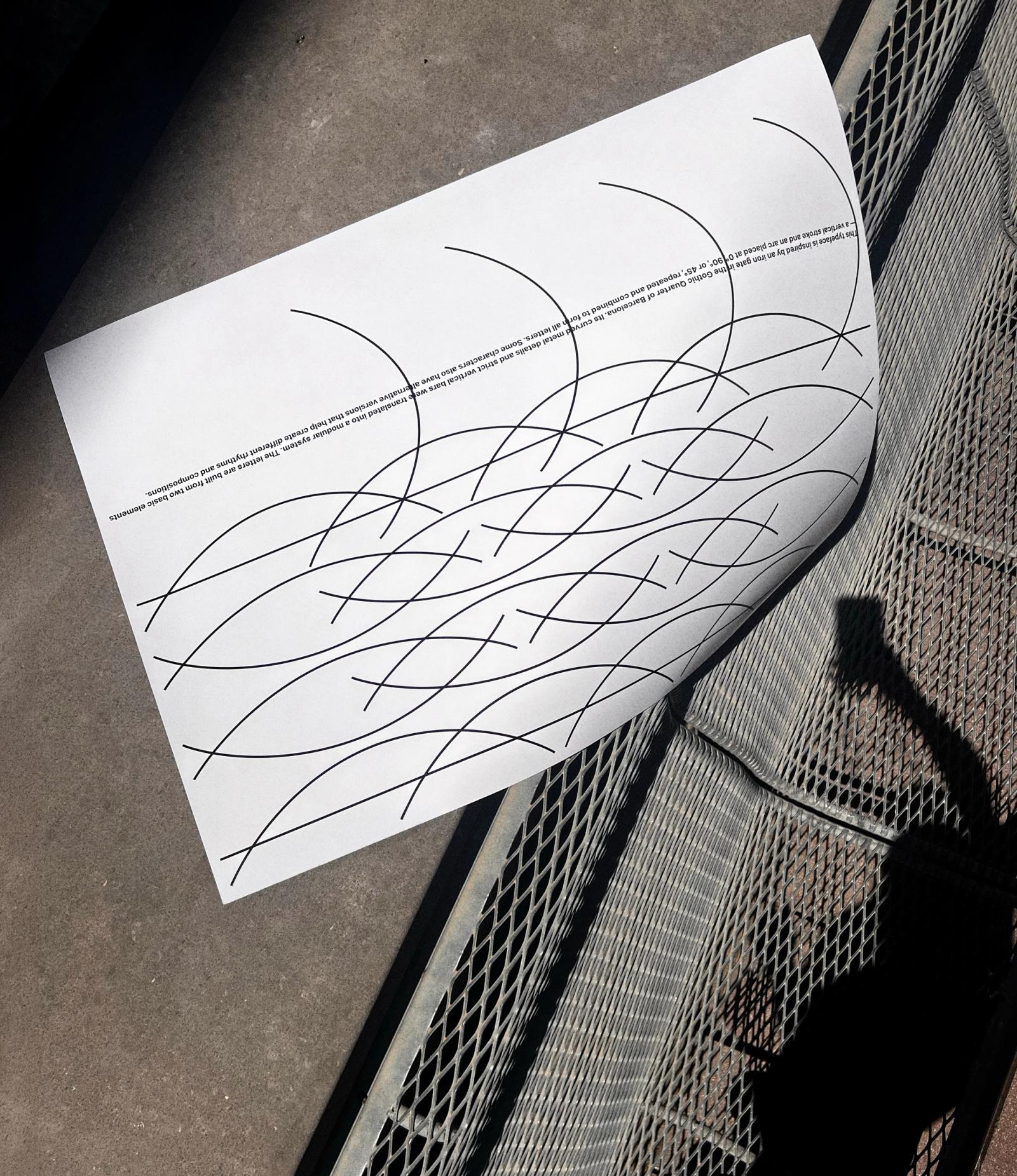
A modular typeface and poster series developed from the structural elements of an iron gate in Barcelona’s Gothic Quarter. The alphabet is constructed using a restricted set of repeatable geometric modules based on the gate’s bars, arcs, and proportions.



KERF TYPEFACE
An experimental modular type system shaped by wide proportions and soft internal cuts.
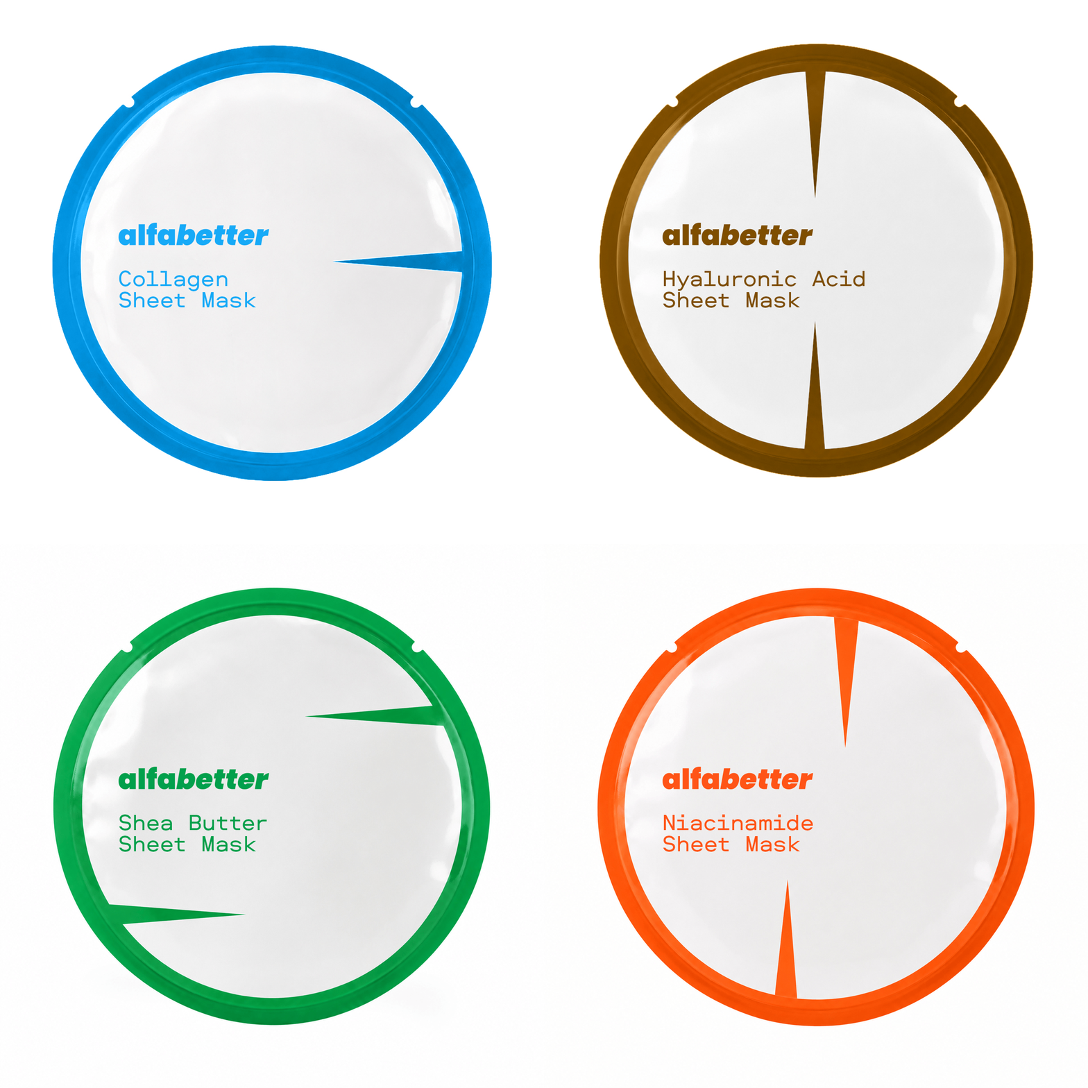
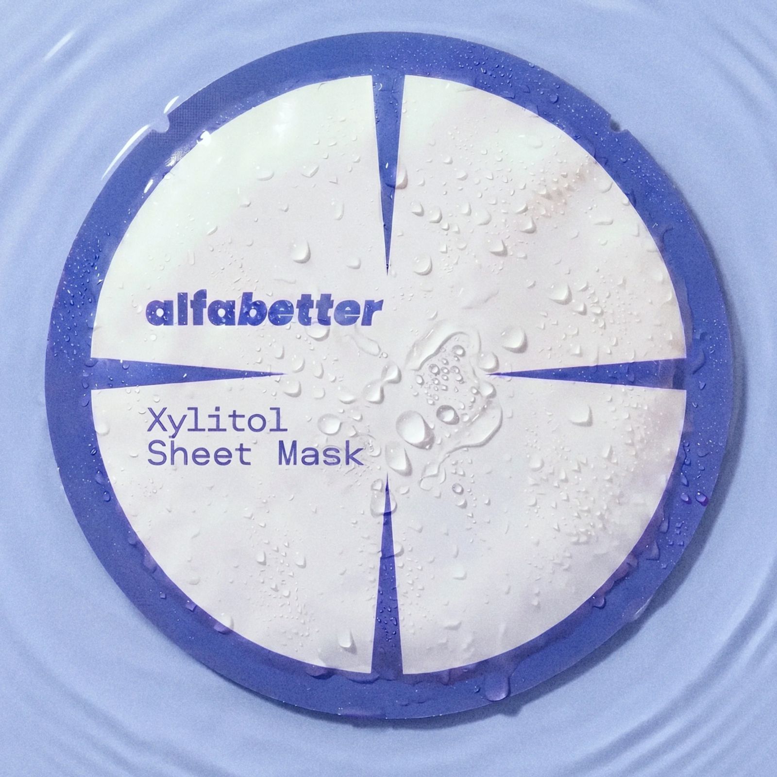
ALFABETTER
A skincare brand based on a letter-to-ingredient principle. Each product is identified by a single typographic symbol corresponding to its active ingredient. The letterforms are derived from the shape and cut lines of a sheet mask.

SPECTRA
A visual identity for an engineering company specializing in glass, mirror, and metal structures. The system is based on material properties, geometric forms, and construction principles, and is applied across digital and physical communication.
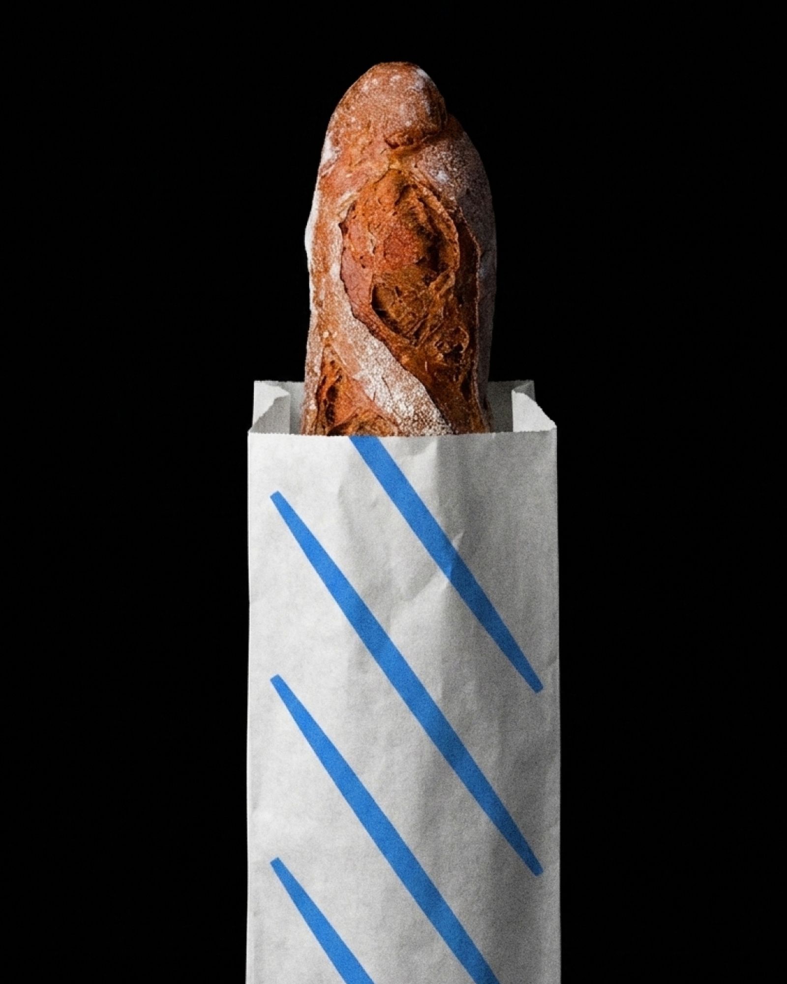
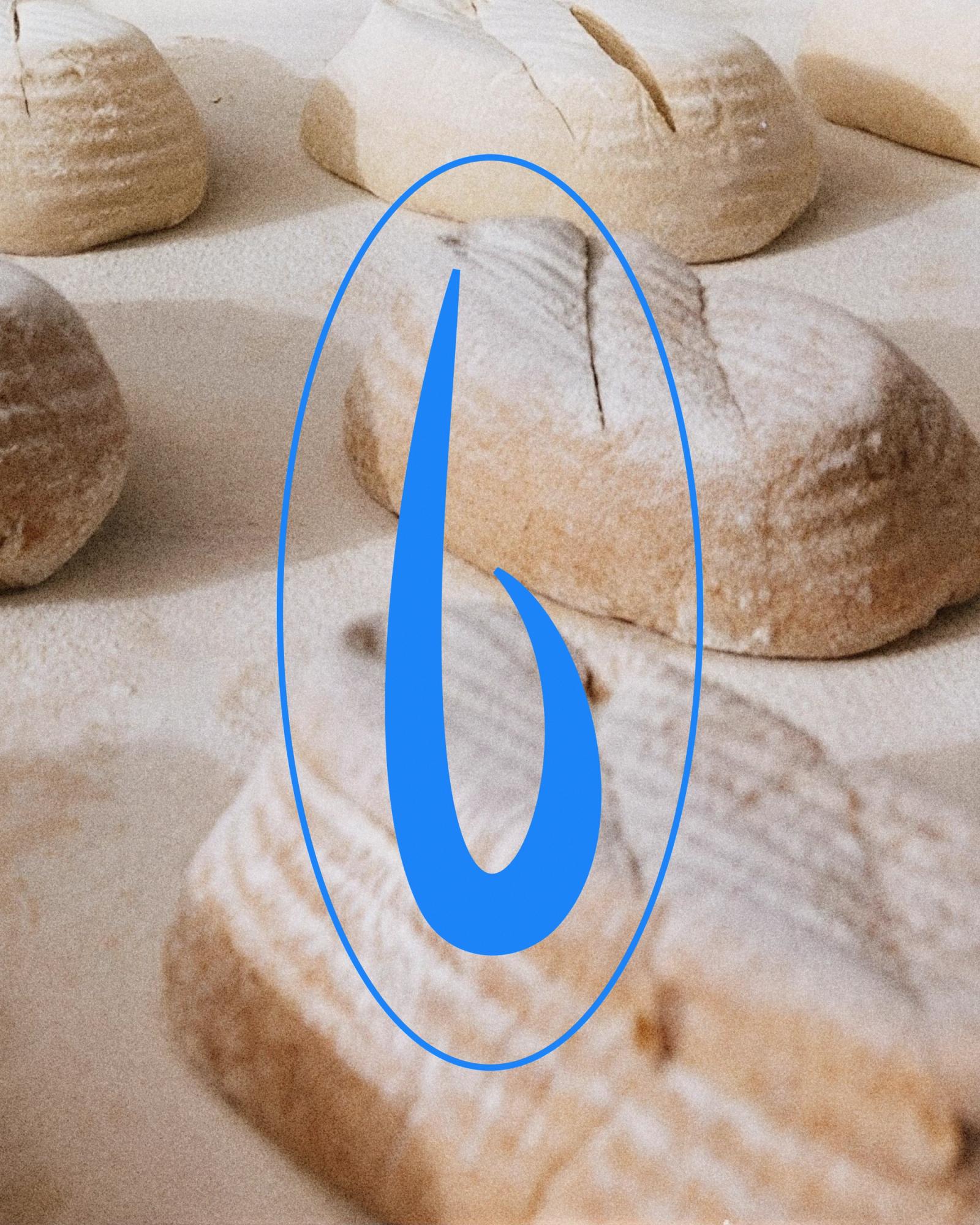
BREADLY
An artisanal bakery identity inspired by the scoring marks bakers make on bread before baking. These unique cuts became the core visual language of the brand, creating a minimal identity that feels crafted, personal, and contemporary.
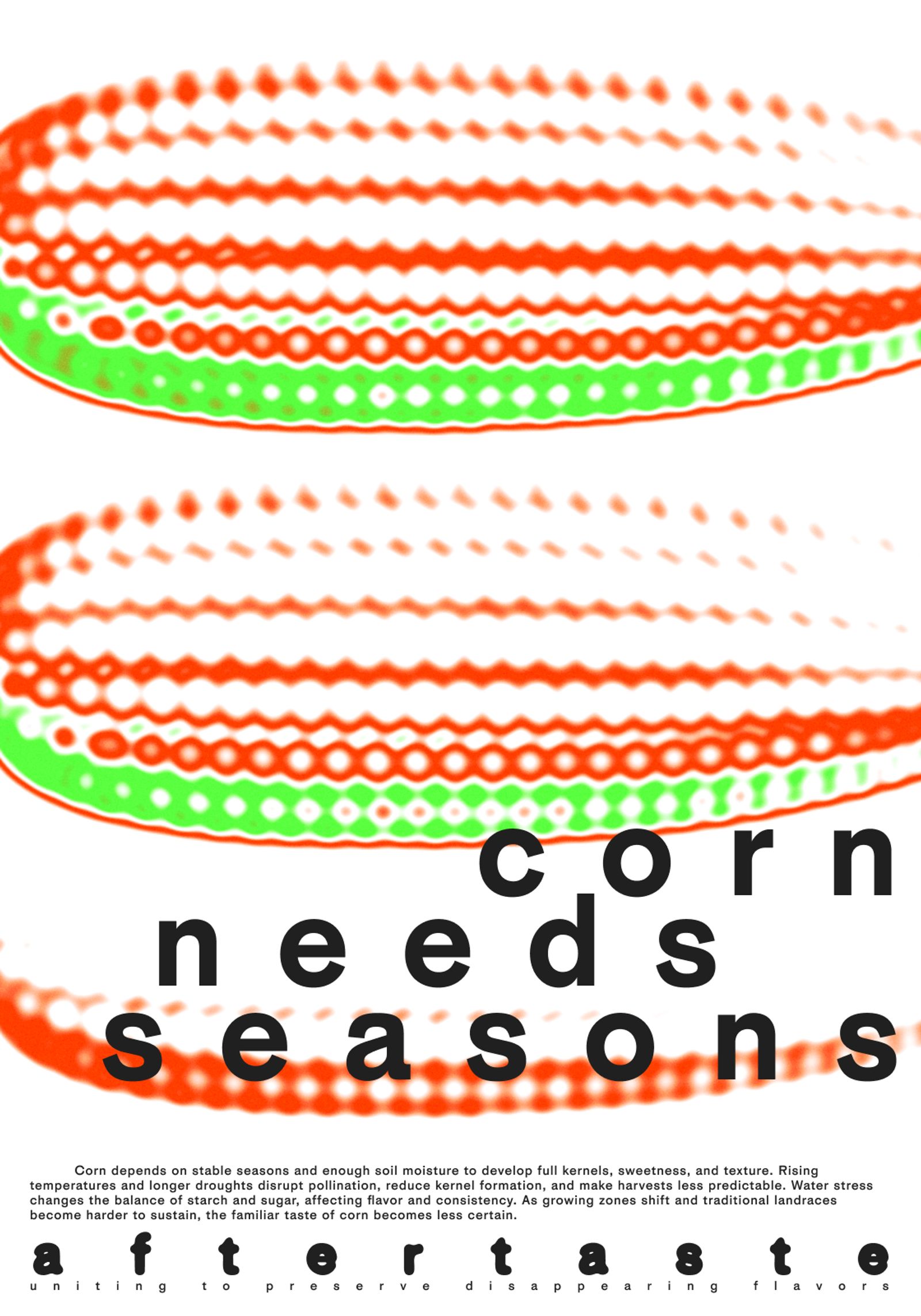
AFTERTASTE
An identity for a non-profit initiative about disappearing flavors caused by environmental issues and human impact. The visual system is built around gradual burnout: color shifts from spectrum to absence through fading gradients, increasing letter spacing, displaced typography, and motion.

AFTERTASTE
A packaging series for candies representing flavors affected by climate change and human impact. Each package uses fading gradients, typographic labels, and flavor-based categories to indicate the gradual disappearance of taste.
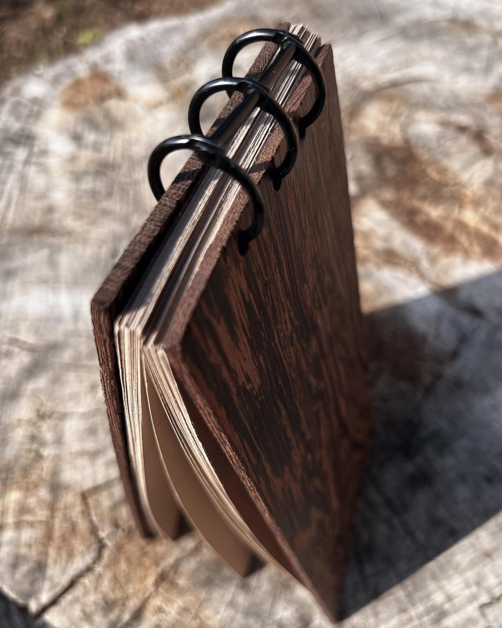
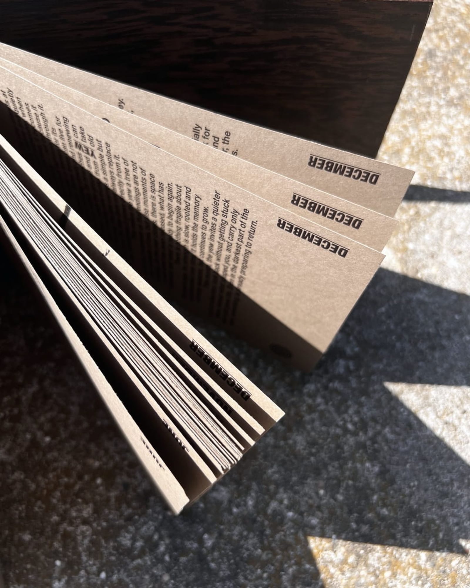
Wooden Book
A seasonal publication about the rhythm of the year, natural cycles, and the way time is observed through nature. The book uses the structure of months, a vertical calendar-like format, and a wooden cover to connect the reading experience with its subject.